Posts

Showing posts with the label book covers

Just a blast from the past...

Image
Just Ashley, my Soom Snow white...I don't usually like gray dolls, but here I am with a three that I just love (four if you count swapping heads)--Ashley, My once-purple Migmas, Isa the second Deesse by Sicktress, and the gray Beryl. That Soom body is the perfect size and so posable with the thigh mobility joint. I have 2 covers due for Edge Tesseract, so I have to not do dolls for a couple of weeks--I realized today that I have done a LOT of covers for ET, and they are not bad! Edge has some very nice covers not by me, so I am in great company. I also found this funny filter version of a cover I did for a novella by Linda Williams (part of the Okal Rel universe), and while it looks goofy, I like the circle design of it a lot--and chewing with the filter let me concentrate on the composition rather than the details. It's easier on the eyes than squinting, too :D Here is the final: I should be doing more YA novels--it's kind of my natural style.

What I Did Yesterday

Image
Finished up a cover! Coming out soon from Edge-Tesseract, with different type--the publisher wasn't fond of the display font I chose, because of readability; but I love it ;) So I can put the copy I like here, tada! Edge has been getting a lot of great manuscripts lately, you should check them out here .

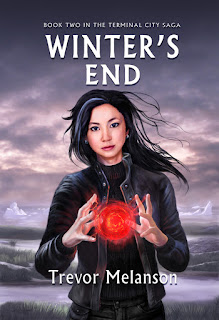
Winters End by Trevor Melanson

Image
Coming Soon from Edge Tesseract (a Canadian publisher); it's a sequel in a young adult series. I think YA is my favorite genre to cover :D

Horth at Moon Shadow

Image
This is a cover (and it may get revisions, I don't know yet) for an upcoming novella (in paperback) by Craig Bowlsby. It's an adventure story set in the Okal Rel universe of Lynda Williams, where Horth Nersal (as a junior Navy officer) crash-lands on a remote, crumbling space station-- and discovers it's very much inhabited...and not friendly. When the Okal Rel property was owned by Hades Publications, I did a few of the covers in the series, and there is a format--a single character on a geometric background for each title. Lynda Williams has bought back the property and is planning on re-issuing the books; so they should be easier to find in the US-- so I wanted to keep the "look" the same as the previous series, but make the design more a natural part of the image instead of a designer pattern overlaid on the image. I had several challenges on this one--first off, I just had no reference--I tried setting up a Poser figure to get a general idea of the lighti...

Griffins and Rubies

Image
This is something I did a couple of weeks ago--the final will have different type (this publisher doesn't like script fonts on the basis that they don't thumbnail well, and I haven't persuaded them otherwise). The file title made me laugh..there are various versions of it in the folder, including THEVERYLASTGRIFFINwtype.jpg. Usually I have Monday_title, Tuesday_title, Wednesday_title, (skip Thursday because of sulking over much needed changes) and then the Final_title, then ReallyFinal, and then ReallyFinal_goodtext. This last week I have been texturing the Loli Hat, and once I figure out what was what on the template, it went a lot faster. (I found a quick way to do it--I slapped a page of text down for the texture map, rendered it and then I could see where the edges of the pieces were). There is a real way to extract the UV's from Poser, but I haven't found the right tutorial for it, and so far my bootleg methods work ok.(the professional way to check textures...

Sabik, Only Crabbier

Image
I haven't been over to istockphoto in ages, but when I got a cover assignment a couple of weeks ago, I though I would go see if I could pick up a few guys at low res for general reference. It seems that Corbis or some other vulture has bought up istock, because the prices! Hot damn, it was 30 dollars for a thumbnail for the ones I was even vaguely interested in. So that was no good, and my clipping files are..somewhere in a tupperware in the basement BUT there was a tall gangly guy sitting in a closet just a few feet away from me, so out he came, along with his friend the Granado Pancho, and they posed for me. It's not an exact likeness of either of them--and that is a good thing. In the meantime I need to go back to my friend Jimmy Thomas over at Romance Novel Covers and see what new photoshoots he has been doing. He's still quite affordable and there is nothing like "work" being paging through a website of handsome men. I need a lumberjack.

Great Classics Book Covers

Image
I don't know what was going on at the publisher's when this series got it's covers, but I suspect an "eff you" from the Art Director. Go here to see more (scroll down past the dire Charlie and the Chocolate Factory). It gets better: Yes, there are more. This is a great opportunity for some amazing fan fic. Viking Moll Flanders could be a lot of fun.

The Fixit Project

Image
Today I worked on redoing someone else's book cover for a small publisher. I actually enjoy doing these finish/repair projects a lot, even though they pay less, because a) I feel like I can only improve what was there before if the publisher was desperate enough to entrust it to me, b) Usually whatever there has a good core idea in it that I can just polish up, and then it's like archaeology, carefully taking a brush and uncovering the good parts and neatening up any untidy parts and c) I'm not starting out with a blank file, which is Not Fun. All that white. Also, sometimes there is a funny story why it wasn't finished. Other times I don't ask :D The photo is one I have been hoarding for ages to use for something, it's a Lego Old Testament set, or also "what I was hoping would be the end result of the polliwog project".

I Did Get Something Done Today...

Image
These books sound so cute. :D

Another Cover

Image
Amusingly, with more clothes than are really in the story, but everyone let me go nuts with flowers and sparkles on this one, so I was happy with it. And the author is a total sweetie--I don't know what it is about this genre, but the writers seem really happy, nice people, and pleasant to work with.(Also the two horror artists I know are also the kindest, friendliest people imaginable--they must just get it all out of their system in their art!)

Version Eight

Image
It usually takes me about 8 versions to get a cover the way everyone likes it. This one may take 9 or 10, but most of it is "set" now. Part of me still likes the Giant Carrot version. And one more:

The Giant Carrot

Image
I'm trying to get a cover into shape, and it's going through it's "ugly duckling" stage...I suddenly realized last night I had inadvertently created a giant carrot on the right side of the picture. More today, and poor Frau Holle is 90% colorized, but not done done.

Your Book Here

Image
Yes, the greatest threat to my income is not immigrant labor, but cheap photo stock, Cheap good photostock. I won't give you the URL, because google knows where it is. And these are pretty nice covers. Downside--you won't be the only one with that cover. At the moment I am waiting for approvals and feedback; things are being rearranged at the publisher so that either they will start getting back to me more quickly or they will start just buying the stock off this website. (You can buy the same guy/same pose in 12 different colored kilts--I would be tempted to get them all and make an Andy Warhol poster out of them.)

Cleavage

Image
I've been doing a lot of romance covers, which I enjoy a lot. They do have their own challenges, though. My favorite publisher makes me set type, which I do not enjoy so much, and getting an interesting design with type is a different skill set than just painting. I like this cover a lot, but the challenge was "cleavage". The problem is that cleavage, by nature is horizontal and a bit repetitive, like this: oo . So if you have a dark cover, with light cleavage, and a lot of "o"s in the title, you can have problems, it's not very dynamic. (This is why sometimes you see women on historical covers in odd positions, so the design gets some diagonals like this o* or this*o, or there is a lot of flowing hair or ribbons. For this one it helps a lot that the "of the" is smaller, and her hand makes a vertical shape to help make an edge after "Ann". And bless the author for having a short name. This cover isn't approved yet, but I am hopeful...